When I started planning our kitchen remodel, I had a few goals in mind. Naturally, I wanted to update the space to have it reflect our style. And, I had to replace some of the ancient appliances so that actual cooking could take place.
But, I also really wanted to improve the flow of the kitchen, increase the work space, and maximize storage.
The kitchen truly is the heart and hub of our home. There is a constant flow of kids coming and going through the side entry on the right and the stairs on the left. It's quite the circus, especially now that one of my kids has taken up juggling.
He'd better not hit my chandelier!! ;)
Since we were keeping the original footprint of the kitchen, I had to give a lot of thought to how the space could function best for our family.
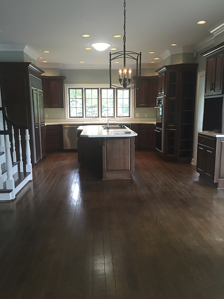
I took this next picture the day before demolition began. You can see there was wasted space above the cabinets. The only thing that was stored on those ledges was dust :)
The cabinetry between the kitchen entry and the door to the backyard always bothered me. It closed in the kitchen and blocked the light. And, it really didn't offer any efficient storage.
I decided I would rather replace the sliding glass door that we never used with a window, and put in more storage below.
I had to sacrifice my farmhouse table to accommodate the new cabinetry, but I LOVE our new round table. It's actually much more intimate, and makes for better traffic flow through the kitchen.
The new window opens out to the deck, and we had a small wooden bar built outside, so I could toss food out to the kids and they wouldn't have to come in and mess up my new kitchen. See... I put a lot of thought into this plan.
Inside, the new cabinetry gives me plenty of space to store the endless piles of paper that turn up out of nowhere and junk up the house.
And, it's a great spot for serving food and drinks when we host parties.
On the other side of the kitchen is our back stairway that used to house a small closet and desk underneath it...
This area was really a waste of space. The desk was ridiculously small to actually be able to sit and work, and the closet was too far from the cooking area to function as a pantry.
The space now functions as a beverage center with a refrigerator, sink and hidden coffee bar.
Our previous kitchen island housed an enormous cooktop and a prep sink, leaving very little space to do any prep work or serving.
We never used the sink. I stored papers in there. Don't judge.
I was so happy to get everything out of the island, and just have a clean expanse to serve food or have folks gather around. However, I will admit that it has been hard for me to break in the new marble. I'm getting better ... slowly...
The island is large and has loads of storage on one end. Having counterstools that slide underneath the other end helps keep obstacles out of the way so the savages can easily raid the fridge.
We kept our big ole' subzero refrigerator, because some things just aren't made like they used to be. We had some small repairs made to it in the past, and were told this beast still had a long life ahead of him. I hope so!!
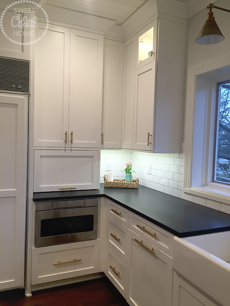
Next to the refrigerator, we installed in a microwave drawer. This is the kid's favorite thing ever. Everyone who comes to our house for the first time has to agree to a 45 second microwave demonstration.
Cooking has become much easier now that we have a properly working range and oven. I'm even enjoying cooking more now. A little bit. I'm trying to anyway.
So, hopefully that gives you a better idea of the kitchen layout, and why I made certain decisions.
Hey... did you notice the crockpot on the countertop? I'm writing a blog post and cooking dinner. Seems like I really have my act together today. Good thing you can't see the rest of my house :)
Have a great day!!


